Vertical & mobile video: a UX that (really) converts
Being responsive is no longer enough.
Today, mobile accounts for more than 65% of e-commerce traffic. And yet, many sites continue to model desktop logic on a 6-inch screen.
Result? Infinite Scrolls, content that is difficult to read, and purchase paths that lose the user even before the click.
At JOIN, we are convinced of one thing: The Format Changes Everything. And in particular The vertical format, designed mobile-first, but especially conversion-first.
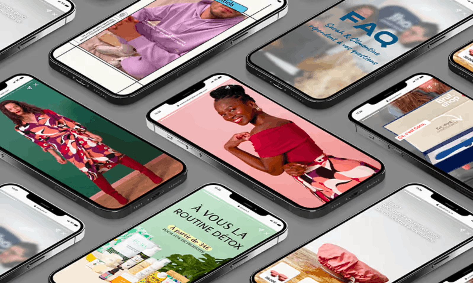
The Mobile Is Not Just a Small Desktop
When you're browsing on a mobile, you don't read: you scans. We Don't Click: We Tape. And Above All, We Want Understand Quickly, Well, and Without Friction.
The problem? The majority of product sheets or category pages are not adapted to this mode of navigation.
These are often:
- blocks of text that are difficult to read,
- static visuals that are not very engaging,
- action buttons that are not very visible,
- and unintuitive ergonomics.
And all of this is Turnover That Evaporates.
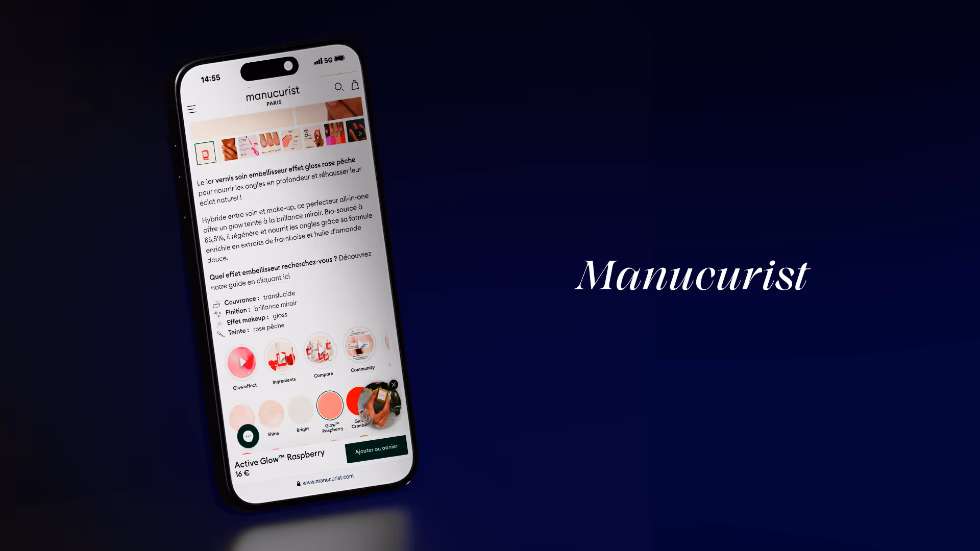
Vertical Video: A Format That Fits Mobile Use
Vertical video is not a trend. It is a Behavioral standard. Instagram, TikTok, YouTube Shorts... the user has already adopted these codes. JOIN allows you to activate them on your site, in the right place, to transform the mobile experience into Ultra smooth course.
Why does that convert?
- It's full screen, immediate, native. No need to swipe or zoom.
- It's sequenced. In a few taps, the user understands what your product offers.
- It's dynamic. Animated text + visuals + voice or music = quick comprehension.
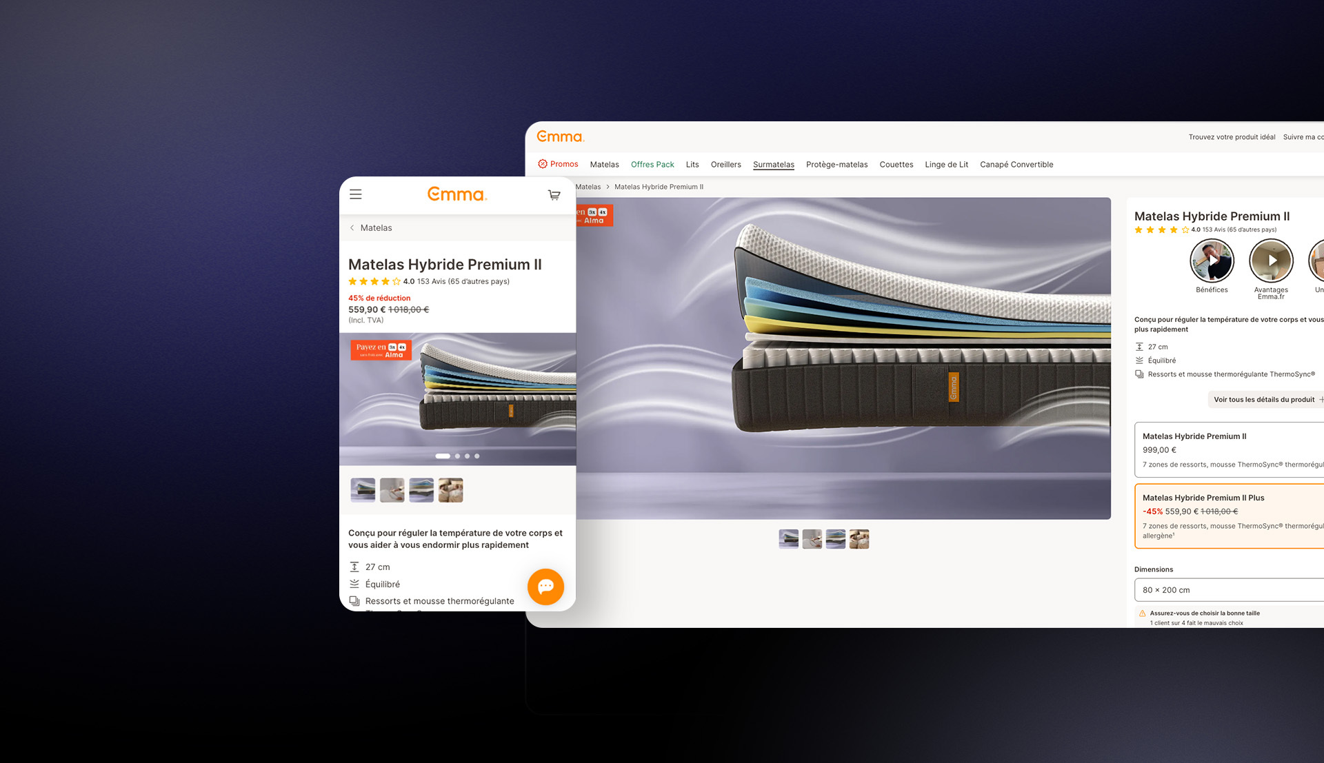
- It is actionable. Each JOIN video can include a clickable CTA, visible from the first seconds.
Concrete results: when UX becomes ROI
This format doesn't just “please.” He Accelerates the purchase decision.
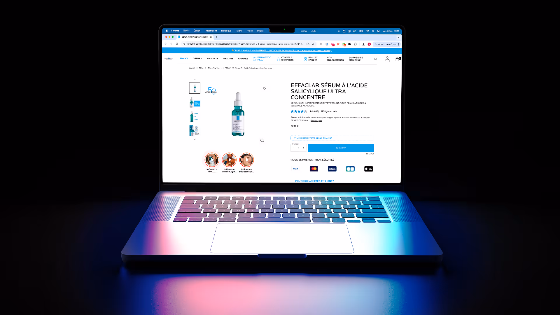
🎯 Exemplo:
A beauty brand like La Roche-Posay Saw a +34% of clicks to product sheets after integrating JOIN Web Stories at the top of its mobile category pages.
Another Impact: The Time Spent Looking for a Product Has Been Cut in Half.
Less scrolling, more action.
5 best practices for optimizing mobile UX with vertical video
1. Position your stories where the attention is maximum: At the top of the page, in the category pages or directly in the product sheets.
2. Limit each sequence to 10-15 seconds: The attention on mobile is brief. Be clear, visual, and impactful.
3. Multiply the angles: one product = several possible formats (unboxing, tutorial, testimonial, before and after...).
4. Add clear CTAs from the start: “See the product”, “Add to cart”, “Discover the range”...
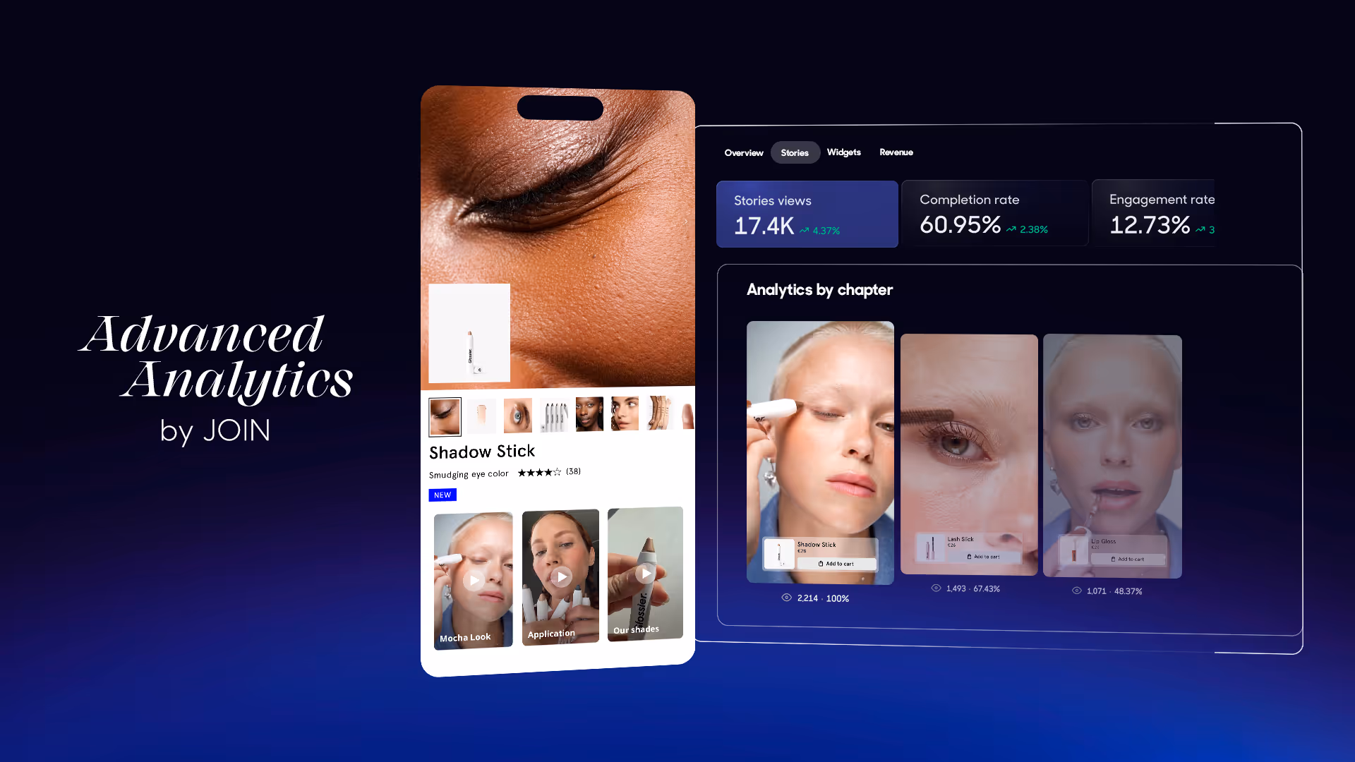
5. Follow the right KPIs: CTA clicks, full viewing, average time spent. JOIN provides you with this data natively.
JOIN, your UX booster
JOIN doesn't just help you make videos.
We help you:
- Identify the right content (via TikTok Connect, UGC 2.0, video retrieval client),
- Broadcast Them Automatically at the Right Time (via our Product Matcher),
- Test and Improve Them Continuously (via Advanced Analytics).
On Mobile, the JOIN vertical video Becomes Your Best Product Page.

In conclusion
Vertical video is no longer about gadget innovation or just a fad. It is a User reflex, integrated into all mobile uses.
By integrating it intelligently into an e-commerce journey, we are not “adding video”: we are not “adding video”: we Restructure The Story Produced, we Enough Reading, we Shortens the Decision.
This format is redefining what we expect from a good mobile UX: less friction, more meaning, and an experience that works from the first second.
{{cta}}